
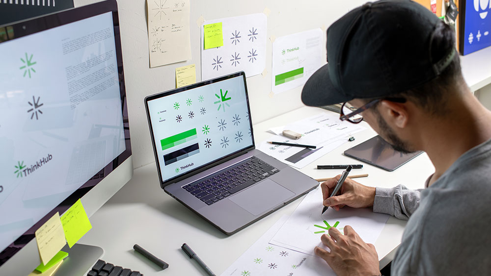
The design of a visual identity should not only be an aesthetic issue, but also a tool for inclusion. However, many brands still do not consider accessibility in their branding, which excludes millions of people with visual, motor or cognitive disabilities.
Being an accessible brand is a responsibility, but it's also smart for business. And the good news is that it doesn't mean sacrificing creativity or visual impact. It's about designing with intention, ensuring that everyone can perceive, understand and interact with the brand identity without barriers. Not only does it benefit users with disabilities, but it improves the overall user experience.
Accessibility from the logo: more than just a pretty picture
The logo is the visual signature of a brand, but what if it is not legible for part of the audience? An accessible logo must comply with some basic principles:
- Simplicity and clarity: Less is more. Overloaded designs or difficult typography can be an obstacle to legibility.
- Good contrast ratio: The logo should be recognisable in both colour and black and white, to ensure visibility in different formats and for visually impaired people.
- Adapted versions: In addition to the main logo, it is advisable to have simplified versions that work in small sizes or in contexts of reduced accessibility.
- Compatibility with screen readers: Including a description of the logo in metadata helps visually impaired people understand the meaning of the design.
The importance of colour in brand identity
Colours not only convey emotions and values, they also determine the accessibility of a visual identity. Some fundamental keys:
- Sufficient contrast: The colour scheme must be legible for people with low vision or colour blindness. Several digital tools are available to help assess the legibility of the chosen colours.
- Avoid relying on colour alone to convey information: In graphics or iconography, using colours as the only differentiation excludes people with colour perception problems.
- Inclusive palettes: It's not about eliminating creativity, but selecting combinations that work for everyone.
Typography: visible and understandable
Typography is one of the most critical elements in accessibility. Some golden rules:
- Adequate font sizes: Avoid fonts that are too small or too thin and difficult to read, especially on mobile devices.
- Avoid decorative fonts in long texts: Handwritten or highly stylised fonts can be difficult to read for people with dyslexia or visual impairments.
- Correct line spacing and spacing: Good line and letter spacing improves readability and makes it easier to read for people with cognitive difficulties.
Iconography and understandable visual elements
Icons and graphic elements should be intuitive and universal. Some key tips:
- Recognisable designs: A good icon should be understandable without the need for additional text.
- Accompanying text: Wherever possible, include a description next to the icon for clarity.
- Flexible formatting: Ensure that icons are visible on different sizes and devices without losing detail.
- Don't rely only on symbols: A common mistake is to use only icons without explanatory text, which can be confusing for some people.
Clear and unbiased communication
Accessible branding is not only visual; it also involves inclusive and understandable language. Some key aspects:
- Avoid unnecessary technicalities: Messages should be clear and direct, without assuming that everyone understands certain terms or expressions.
- Use of uncomplicated inclusive language: Simple expressions that do not exclude any social group.
- Adaptability in different formats: Ensure that messages are understandable both in text and in audio or sign language in audiovisual content.
Accessibility in branding is not an option, it must be a standard.
Designing an accessible visual identity does not mean renouncing creativity, but building stronger, more inclusive and universal brands. Accessibility is not a trend, it is a necessity. And the brands that incorporate it from the start will be the ones that really connect with everyone.