portada veganarcea case study

Veganarcea

Origins and identity

Veganarcea, a real estate developer founded in Asturias in 1989, decided, after 30 years of activity, to revise its identity with the aim of aligning its visual expression with the firm's current roots and values. A clear vocation for service and a marked Asturian origin (its name, Veganarcea, comes from the union of the name of the Narcea River with the word Vega, which refers to the life that forms on the banks of the river) were the pillars for the construction of its new visual identity.

For this new visual positioning of the brand a whole graphic universe was built to support and enhance both the company's objective activity and its philosophy. The ideas that had to be represented and perceived as united as the basis of its communication positioning; the tranquillity and comfort of working with the firm symbolised by the tranquillity, comfort and calm that is attributed to the vital rhythm of any green and natural non-urban area, in this case the meadow of the river Narcea.

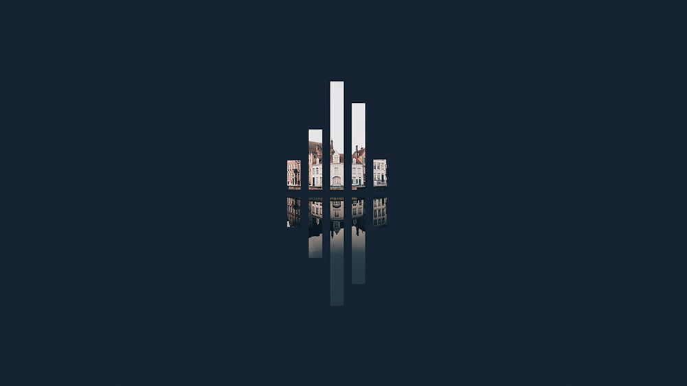
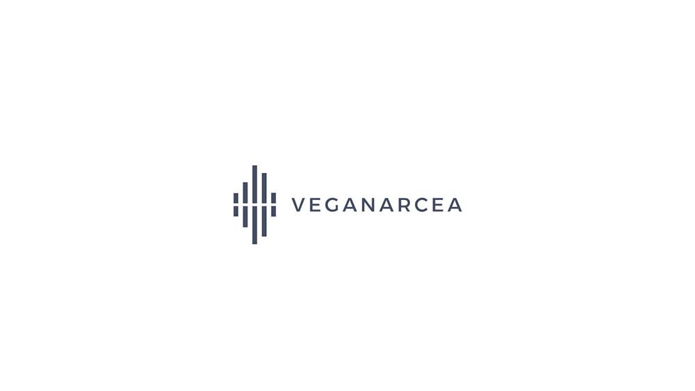
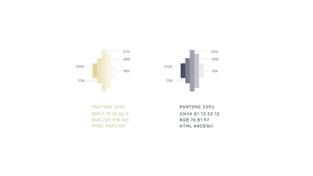
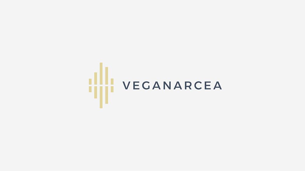
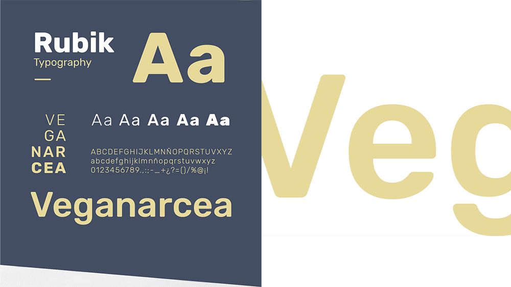
The new visual universe of the brand was based on a new wordmark, a new symbol and new corporate colours. A logotext built with an easy and direct dry stick typography, a symbol that geometrically represents the company's core business, real estate, and its parallelism with its Asturian roots, the Narcea River, symbolised by the reflection of the symbol in the river. In addition, new corporate colours were defined, also enhancing with this tool the idea of nature, purity and closeness.

"A symbol that geometrically represents the company's core business, real estate, and its parallelism with its Asturian roots, the Narcea River".

Veganarcea edificios
Isotipo de Veganarcea en dos colores

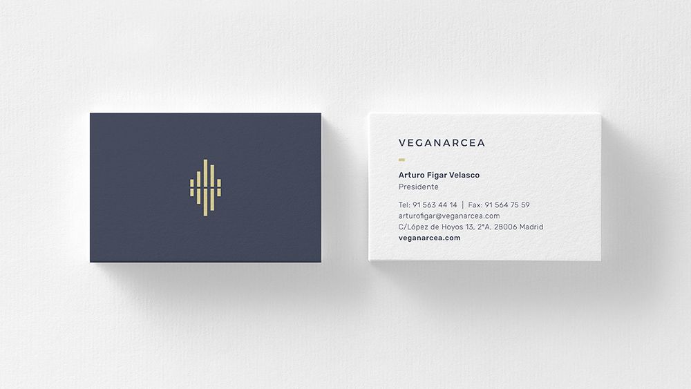
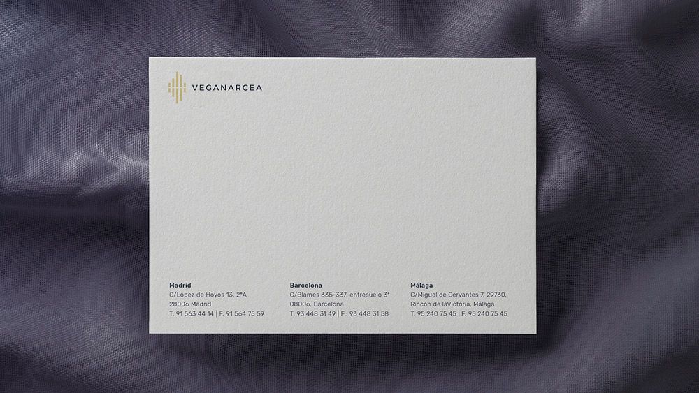
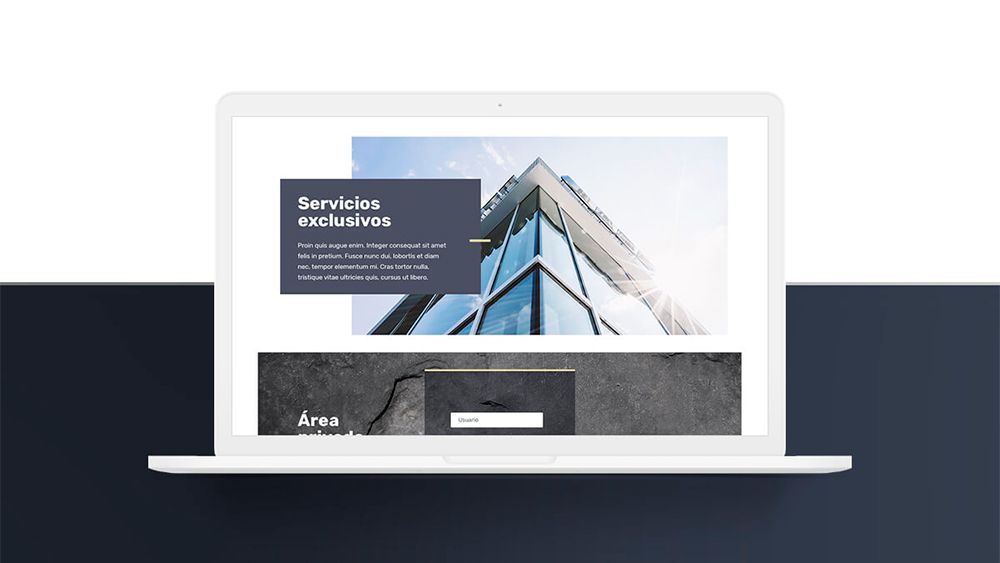
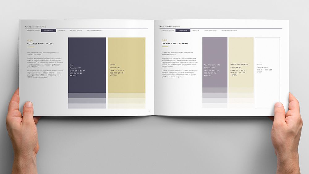
A new corporate colour scheme based on green, yellow and natural tones. The brand's visual universe was complemented by its own system of icons and pictos, a photographic system, new typographies and commercial layouts, etc. All this new visual world was transferred to all the firm's commercial and corporate material, both in physical and digital environments, building a coherent brand image for its stakeholders at all its touchpoints.

Search