
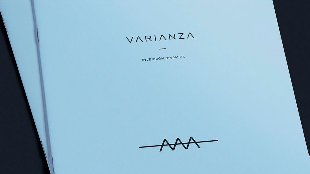
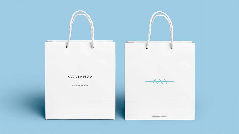
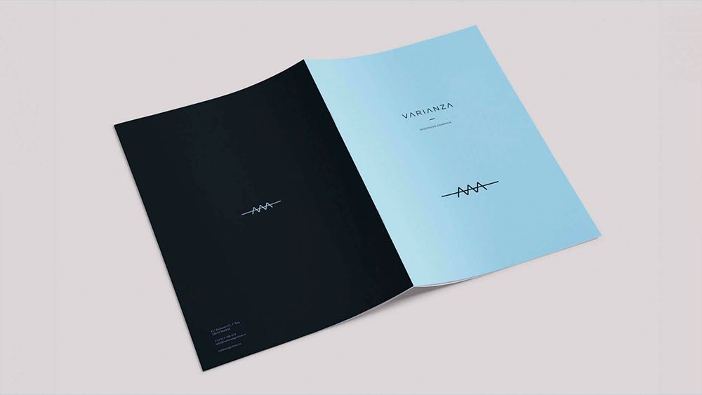
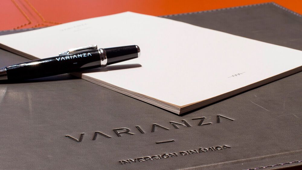
The process began with several workshops with the client to help them define their positioning and brand platform. This positioning set the guidelines for the creation of their visual identity. A naming with a meaning that was not very recognisable made it necessary to build a plastic universe that would intuitively explain the intention of the chosen name. The minimal expression of the brand is represented by a logotext and a symbol, elements that can work both together and separately, giving the brand greater mobility and dynamism.
The logotext was constructed by removing from the structure any element that did not contribute to the readability and comprehension of the signature and support the concept of variability of values referred to in the word variance (by converting the three aes of the naming in ascending and descending arrows). To this logotext was added a symbol, an idea, a concept whose function is to bring together the essence of the brand through its minimal expression..
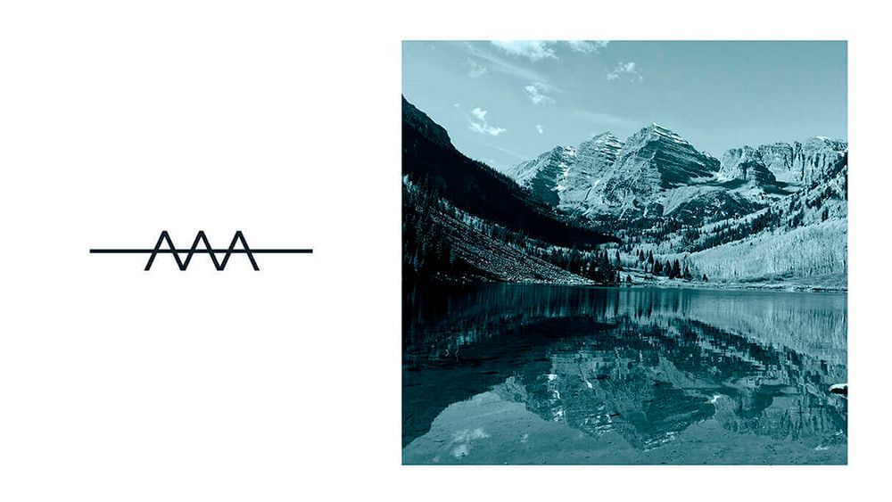
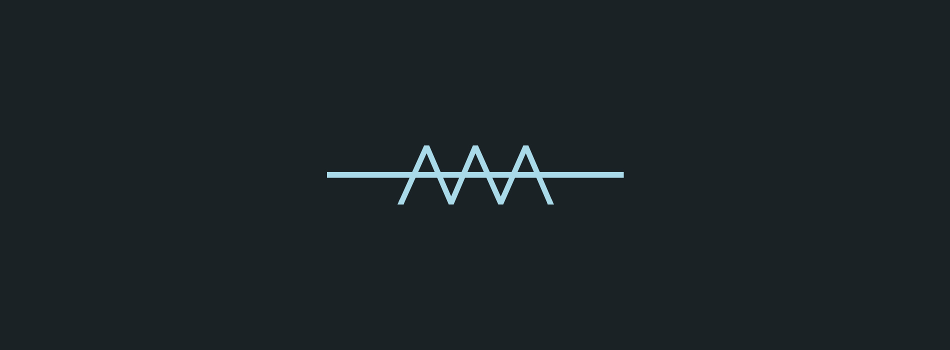
The symbol is made up of three ascending arrows and a line parallel to the base that divides the arrows in their horizontal average. These ascending arrows originate from the original VARIANZA logotext, three A's converted into symbols that, on the one hand, represent increase and growth, and on the other hand, recall the exceptional degree of solvency granted by the AAA financial rating.
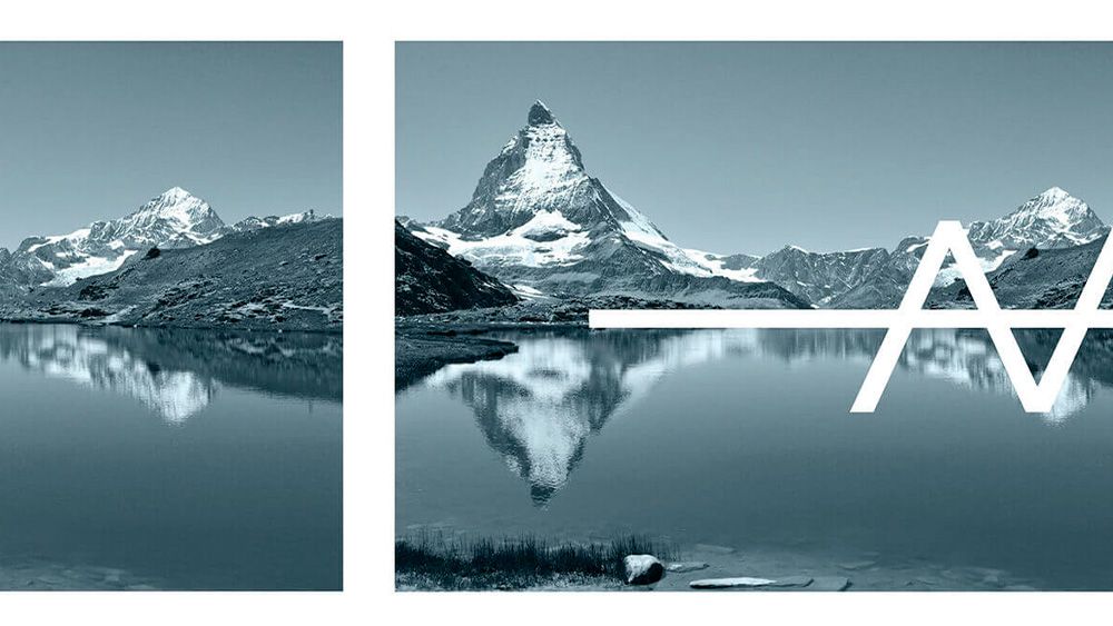
"This triple structure breaks its symmetry with a line that runs along its horizon, a line that becomes an arithmetic mean and transforms the triple structure into a pictogram that draws deviations from this mean".
By clicking "Accept" you agree to cookies being stored on your device in order to improve site navigation, analyse internal site usage and assist our marketing research.