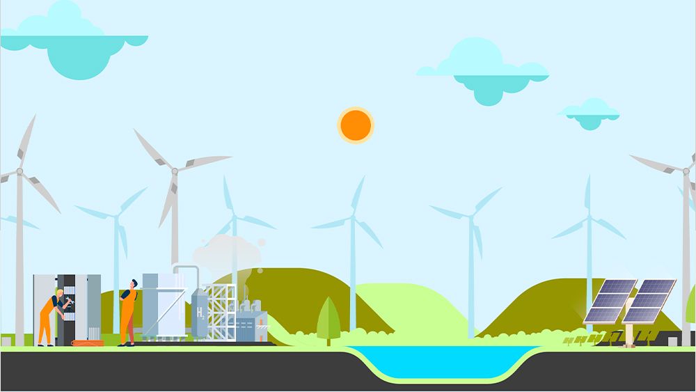
Ilustración para Solida

Solid

A new generation

Sólida is a Spanish engineering company specialising in renewable energies. With 15 years of experience and a presence in more than 50 countries, the company decided that it was time to give a new boost to its brand identity to synchronise it with its current reality, updating its verbal and visual expression to help define the personality of the organisation and make it more recognisable.

Solida gif logo y claim

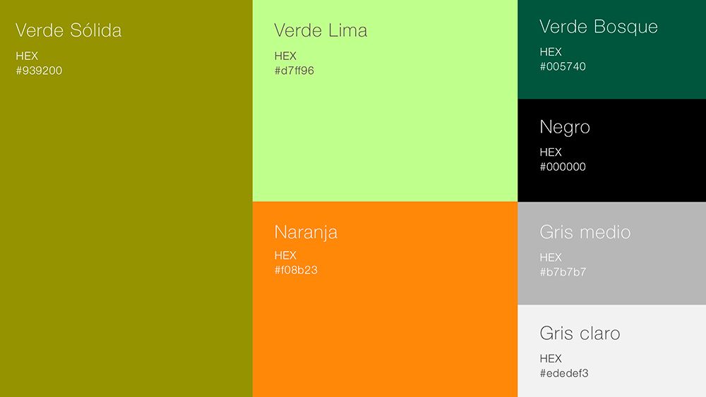
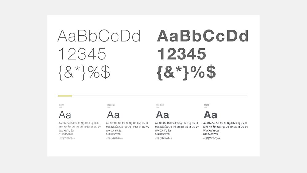
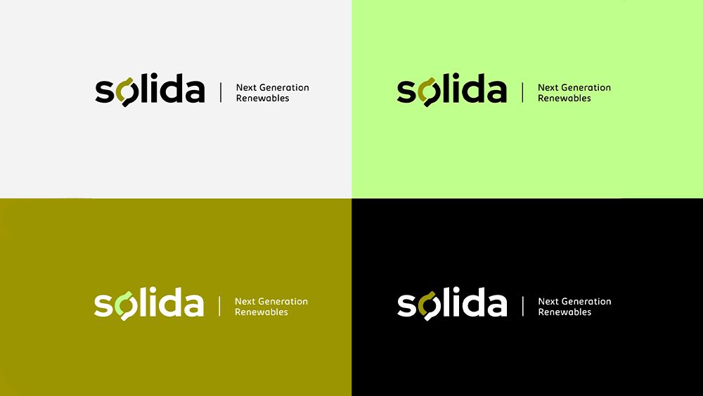
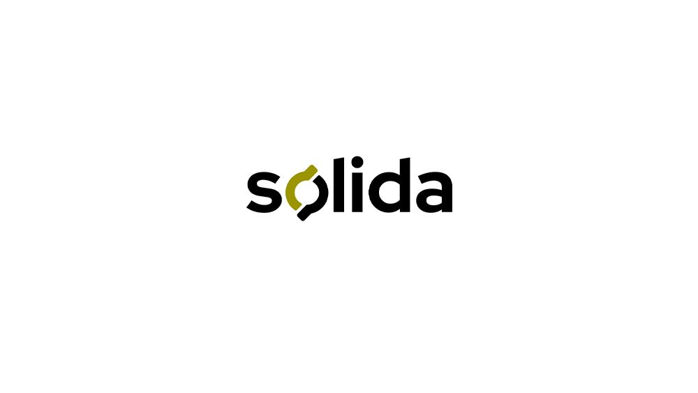
QuumBrand was in charge of this update, designing an identity that would meet the new reality of the company, a more technological, closer, more global and more sustainable reality. The visual proposal started with a new approach to the current logo. A more sustainable and efficient isologo was redesigned, without excess of elements, more flexible and scalable, more digital, both in its shape and in its chromatic proposal, easier and closer with the use of a low box typography with simple shapes, and with its own personality, creating a symbol, a gesture that would turn the structure into something unique, differential and referential.

"A more sustainable and efficient isologo was redesigned, more flexible, scalable, easy and approachable with the use of a low box typeface of simple shapes, and with its own personality".

Sólida logo

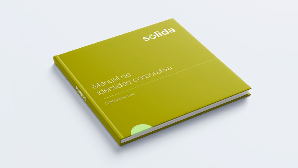
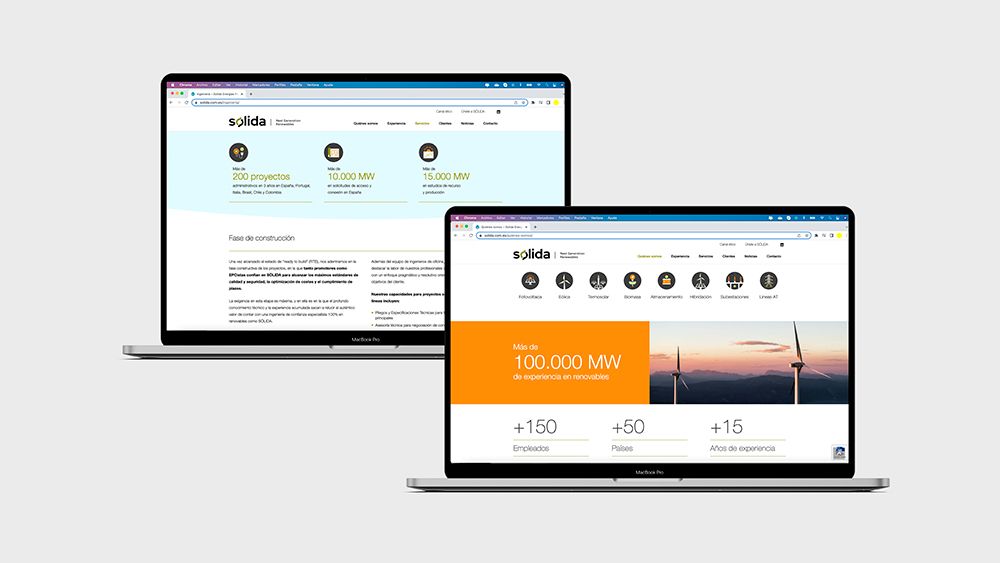
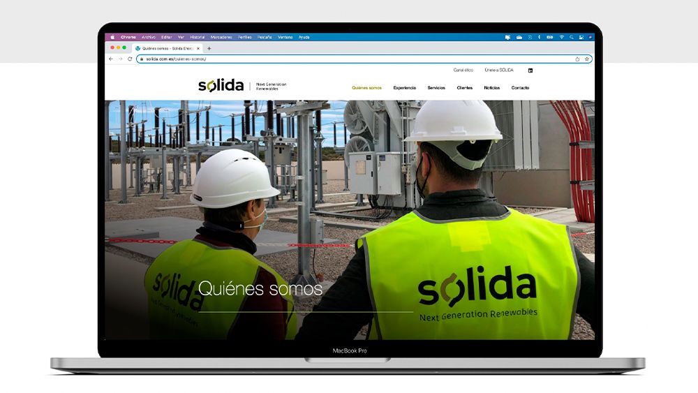
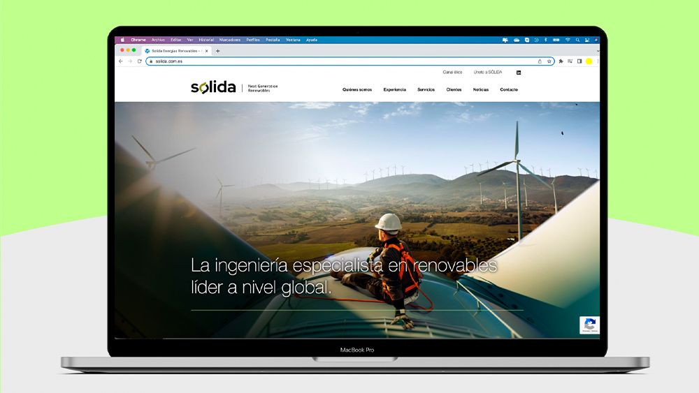
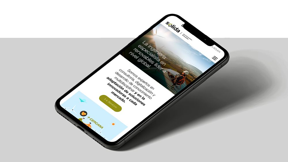
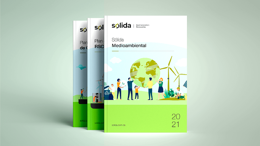
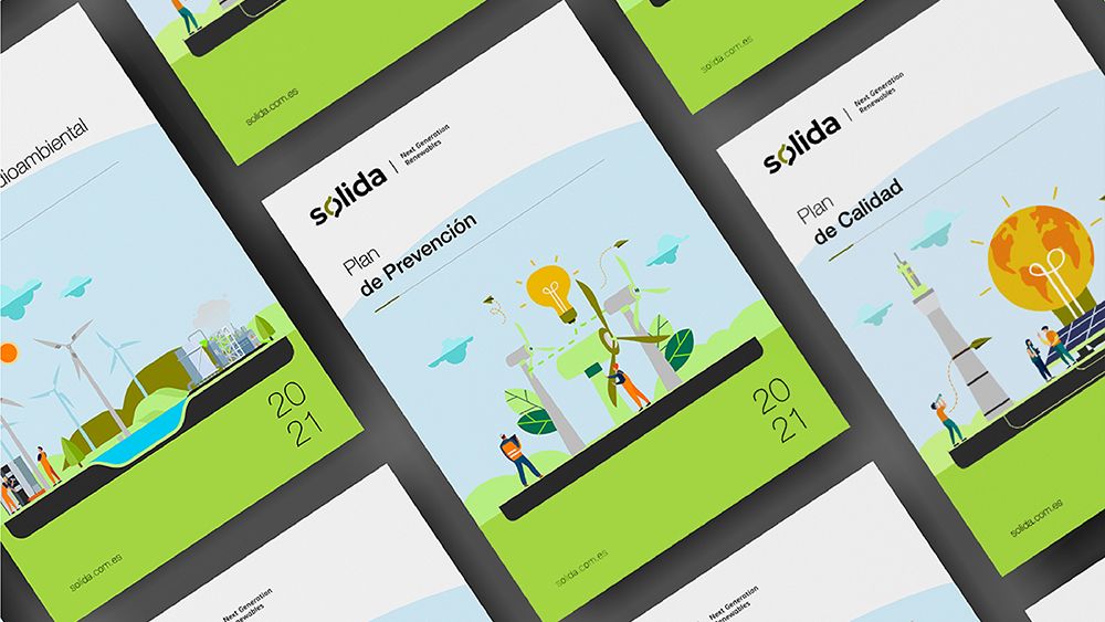
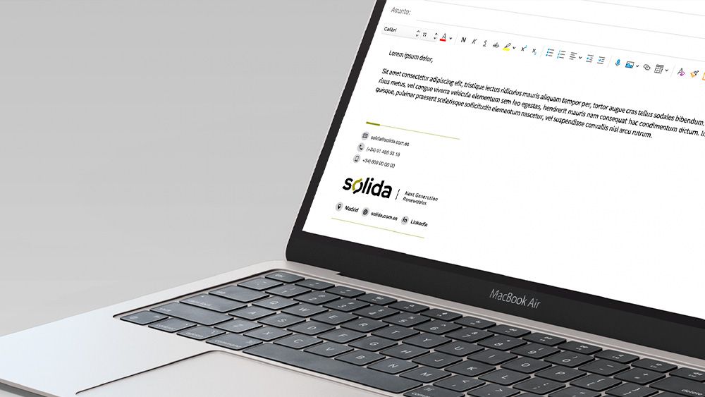
At the same time, we worked on the creation of a verbal identity manual that would give coherence to the brand narrative in all its points of expression. A new brand tagline was added to this proposal as a synthesis of the company's current positioning, Next Generation Renewables. The new visual and verbal identity was transferred to all the brand's communication assets, both physical and digital.


Search