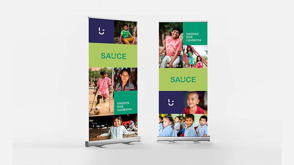
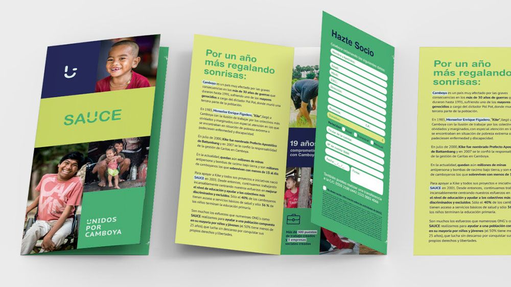
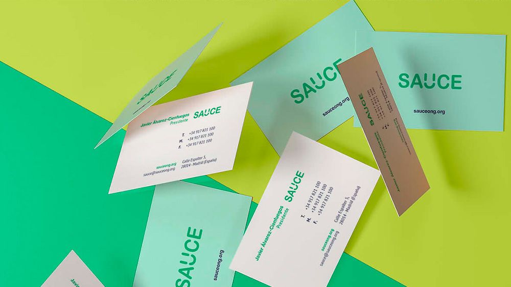
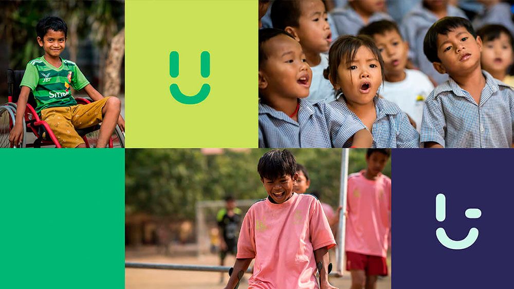
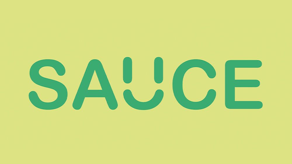
Once the new visual structure of the logo was defined, consisting of the SAUCE wordmark and the new symbol, the Cambodian smile, we began with the visual restyling of all the elements that make up its visual system. In this new structure, the symbol is not positioned next to the logomark, but is included within it, thus achieving a unified and clear structure. The construction is based on a rounded typeface (typefaces that are easier to reproduce correctly in digital environments) with a small gesture in one of the characters, the U, to include the new symbol.
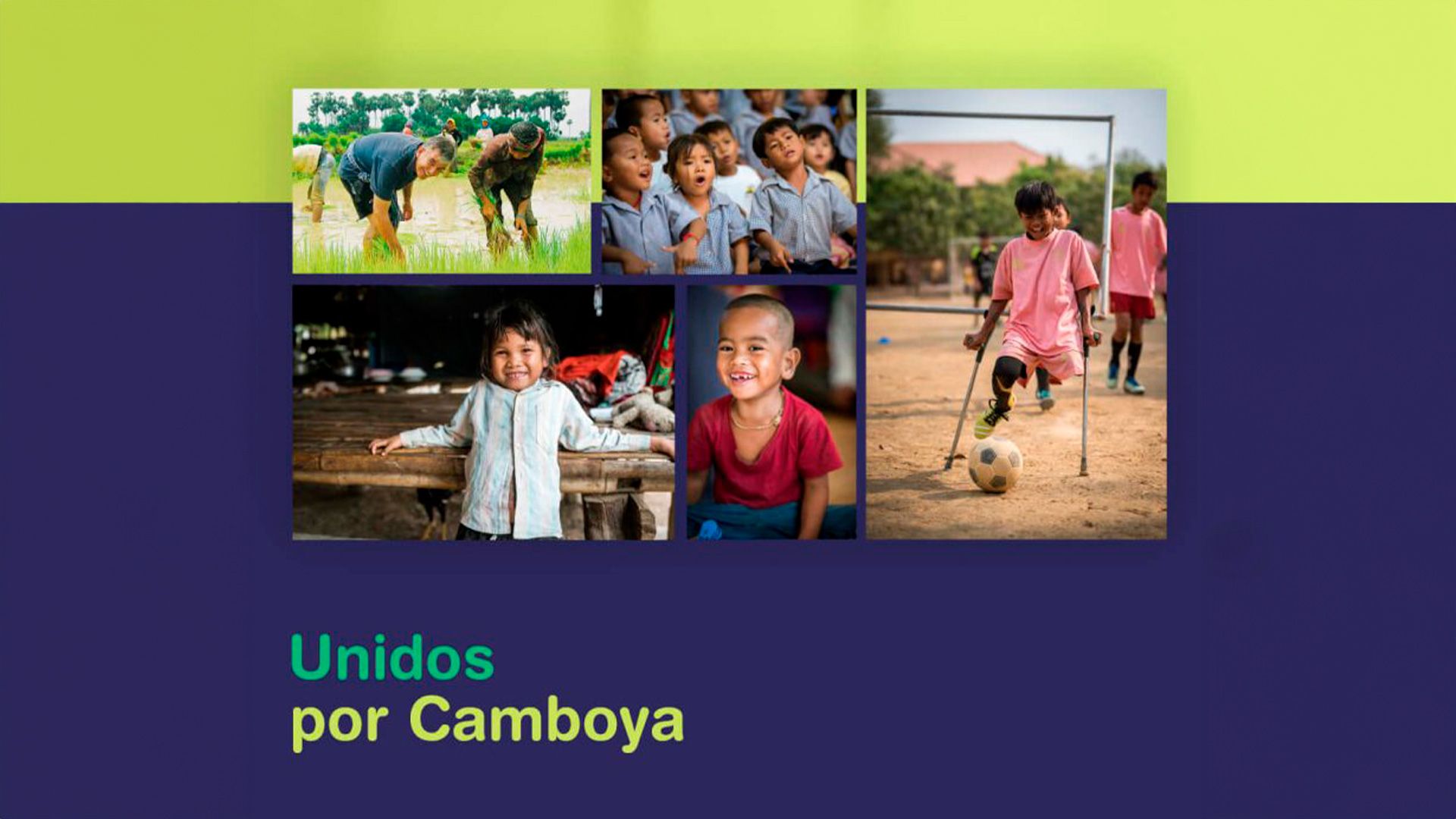
Once the minimum expression of the brand, the logotype, its chromatic palette and its complementary typographies had been defined, a whole visual system was defined to support and strengthen it. This visual universe with a marked naïve character; simple, direct and easy to understand gives the brand the honest and transparent air it needs to be correctly understood.