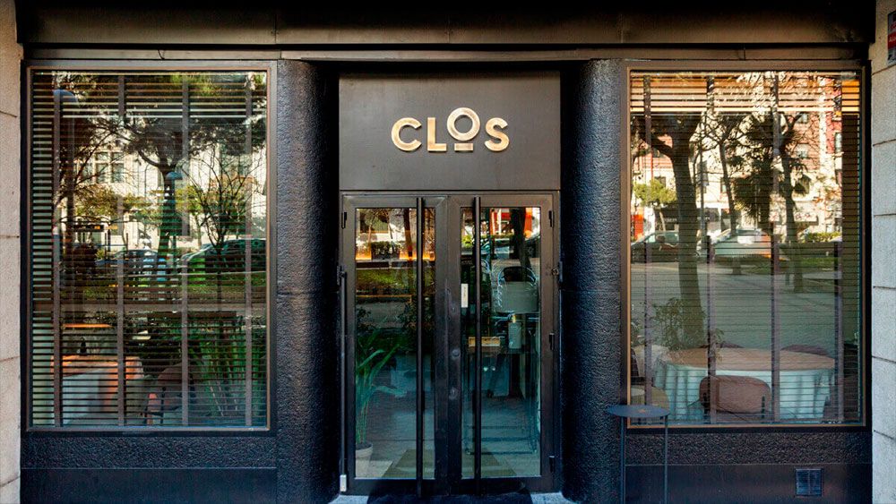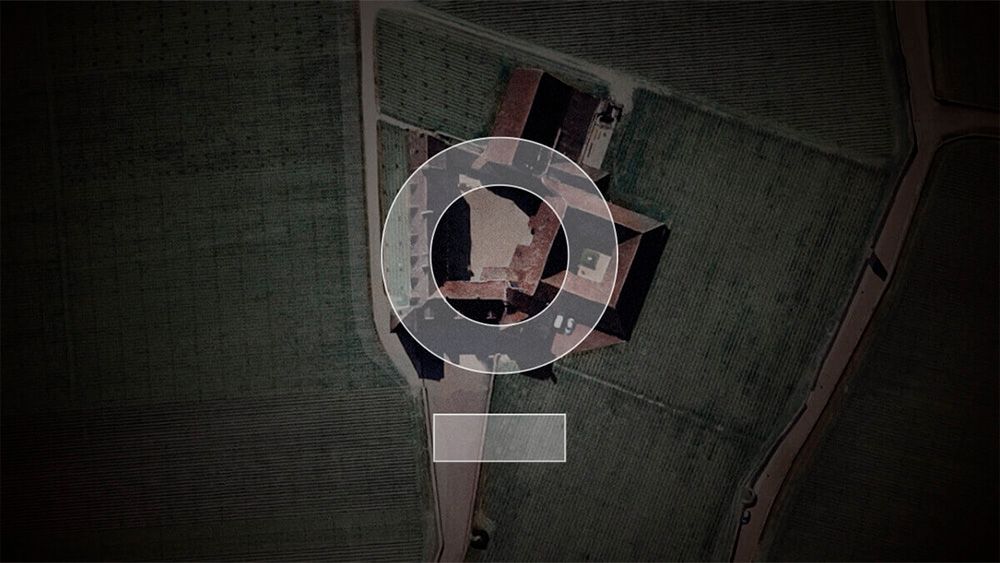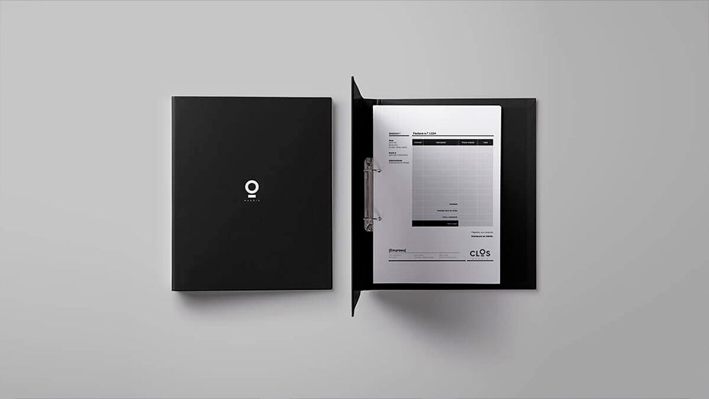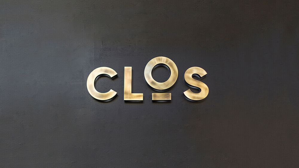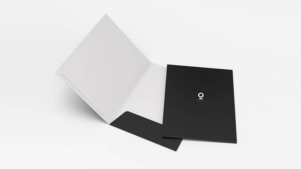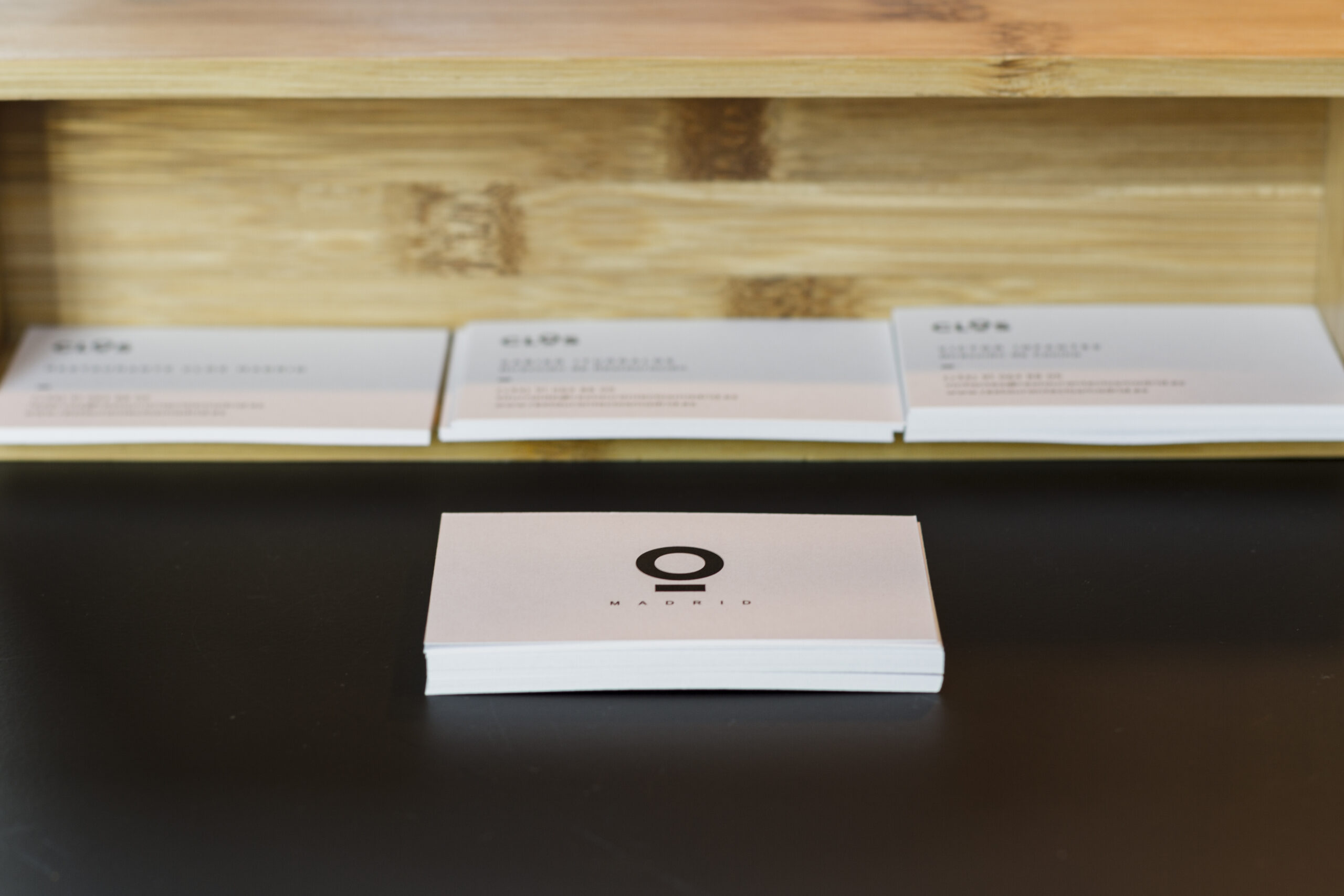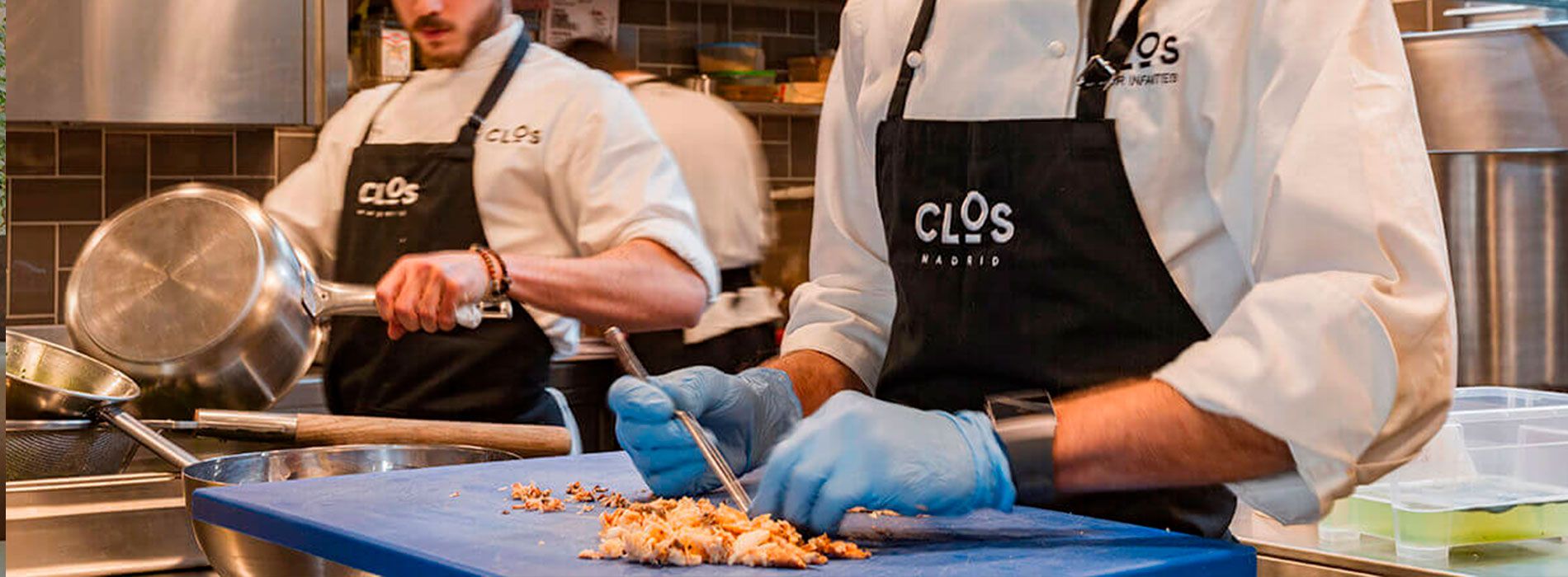
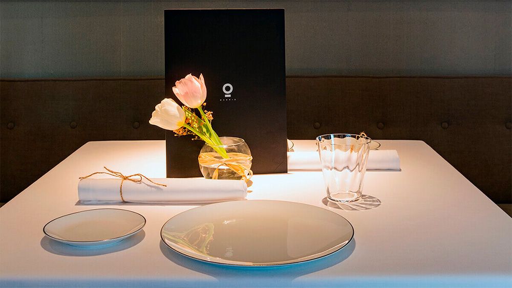
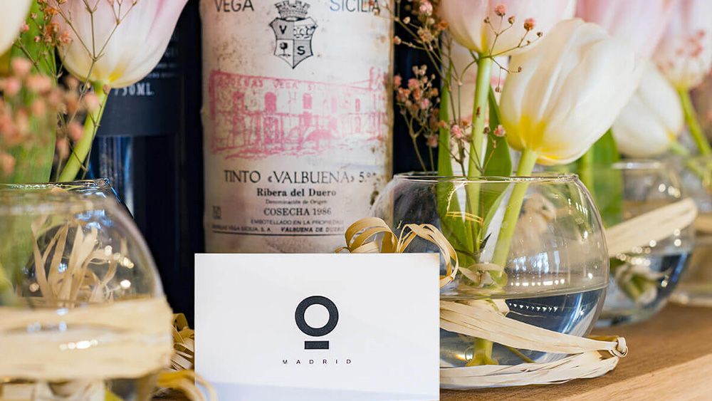
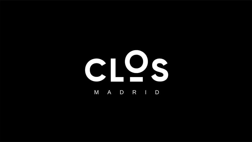
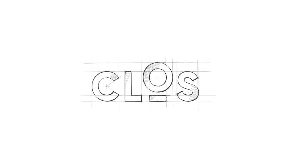
For the creation of the minimal expression of the brand, the logotype, a structure was designed with a bold dry stick typeface as a base and a symbol, included within the typeface, which represents the meaning of the word Clos (walls that surround and delimit a vineyard) as well as the concepts of privacy and unique space. This game is represented in the letter O of the logotext that rises from the base line to enhance its meaning. This minimal expression was exported to the entire gastronomic space; menus, menus, signage, personal kitchen outfit, etc., in order to achieve the same brand experience in all the touchpoints that the firm has with its public.