
&H

Hotels with stories

The parent hospitality brand &H was born with the aim of creating accommodation that makes guests feel like they are at a friend's house where they can recommend their favourite places, meet their friends and discover the city from a local, non-touristy point of view.

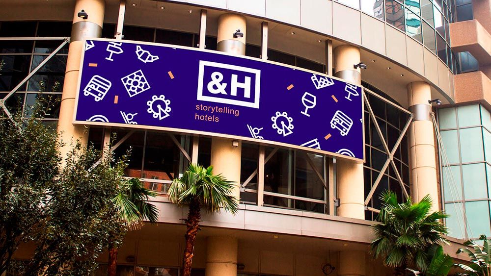
cartel &H morado billboard

To realise this idea, it was decided to invest in the renovation of the Hotel Guillermo Tell to give it its own innovative personality, filling it with stories and interesting details for the guest.and with a team of professionals who are close, attentive and always ready to give expert advice in the city. Thus opening Pol & Grace Hotel. After this first success, the &H Group is in the process of expanding to open new hotels. Its expansion is designed for both national and international territory.

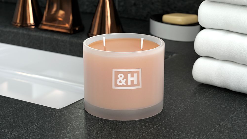
vela hotel &H

Quum helped the company to create and design this new parent brand, &H, a brand that was to reflect a friendly, professional spirit and above all, a "different" spirit of service vocation. that defines its business commitment. Once we had studied its market positioning, its values, its medium-term plans and its direct competition, we opted for a simple and direct graphic identity. A strong and easy-to-understand visual structure that would reinforce the idea of &H as the pillar of all its product brands, including the hotel brand Pol & Grace Hotel, which we have already mentioned.

"A strong, easy-to-understand visual structure that reinforces the idea of &H as a pillar of all its product brands.

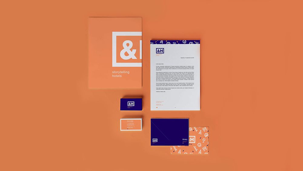
piezas de hotel &H

The minimal expression of the brand consists of a symbol, &, and a letter H, Hotels. Such a short naming helps to have a quick assimilation of the brand, built with a condensed sans serif typeface and a frame that gathers the two characters of the signature. This structure evokes a zenithal view of a floor plan of a hotel room. The logo is accompanied by a baseline that defines the company's positioning, "Story Telling Hotels".

Search