Logo ARC

ARC Group

People first

ARC Group is a full-service financial services firm founded in Shanghai in 2015 and a global leader in SPAC and IPO advisory. As part of the positioning strategy of its corporate brand architecture and portfolio, the firm decided to enlist the services of QuumBrand to provide a visual identity for the group's parent brand, ARC Group.

As a starting point for the creation of the new brand, we focused on the values that the firm shares with the culture of the country from which it operates, China. Values based on personal relationships as the key to success in professional relationships. Closeness to the client, trust, attention to detail and respect for the country's traditions are the keys to the successful development of any business in China, and throughout Asia.

"Under these parameters, we proposed a brand that would visually convey trust and personal closeness on the one hand, and on the other hand, a clear harmony with Asian aesthetic codes".

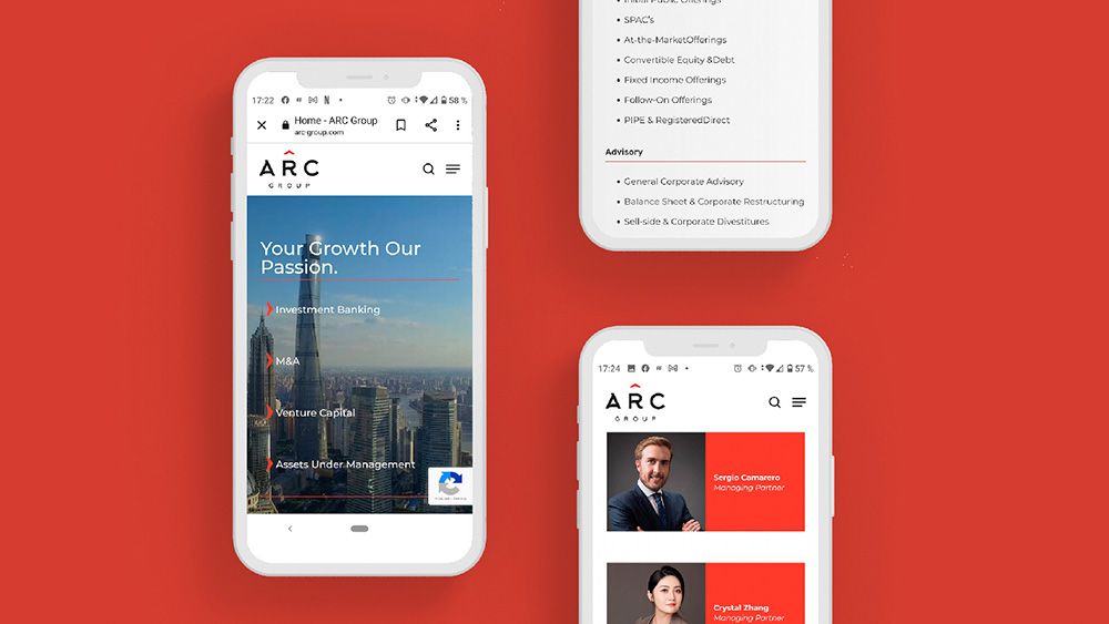
mockup web móvil de ARC

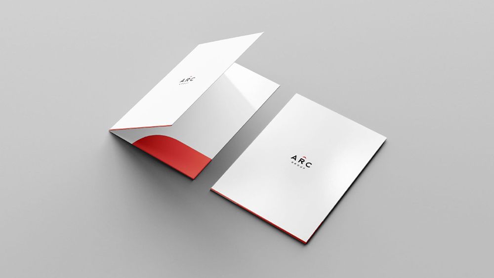
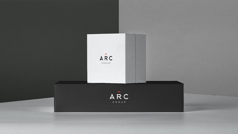
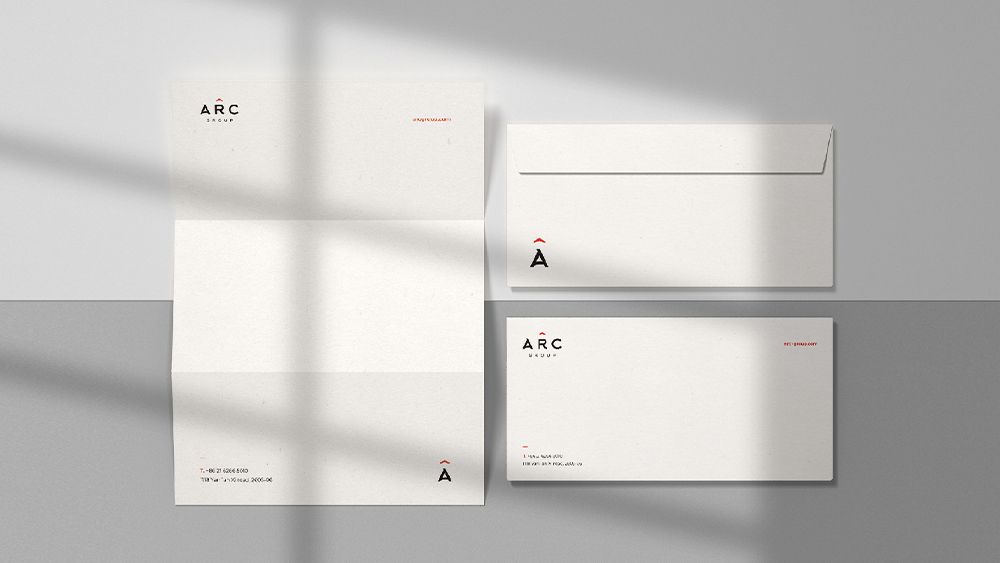
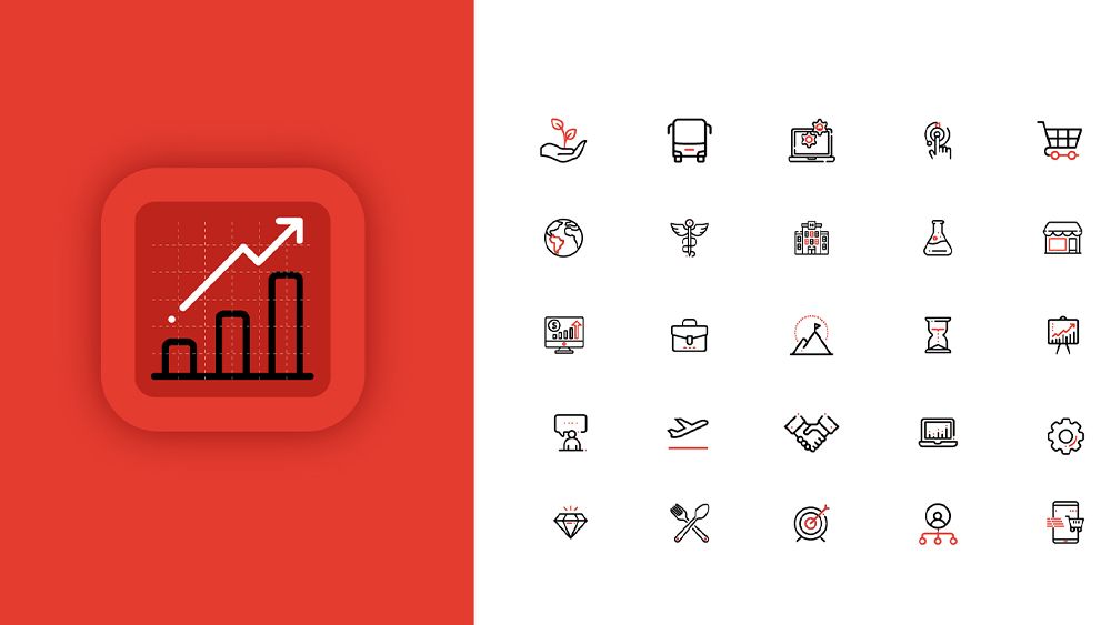
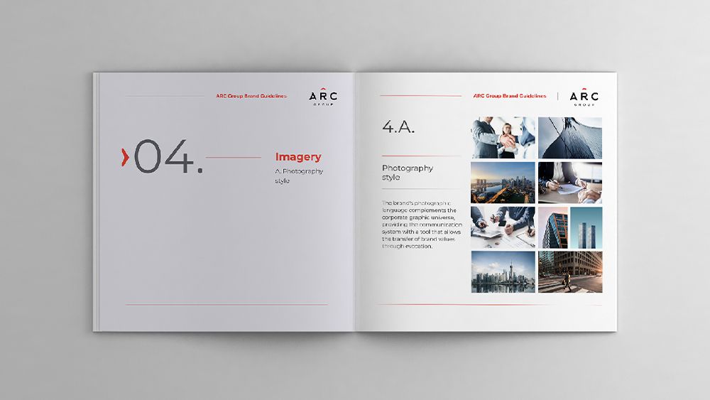
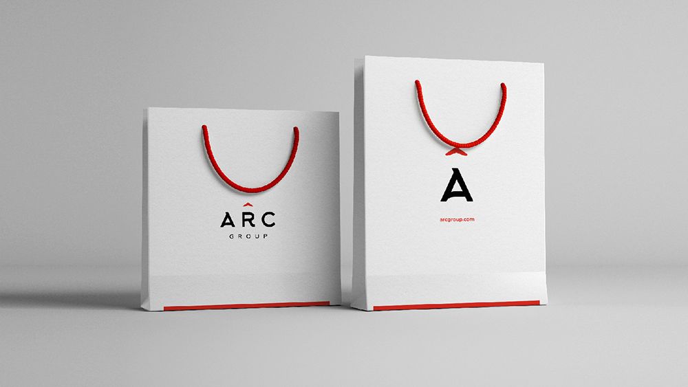
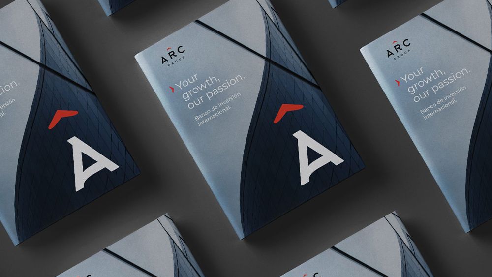
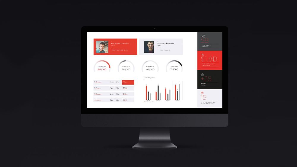
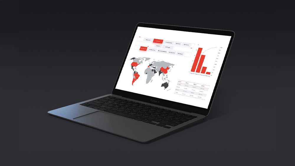
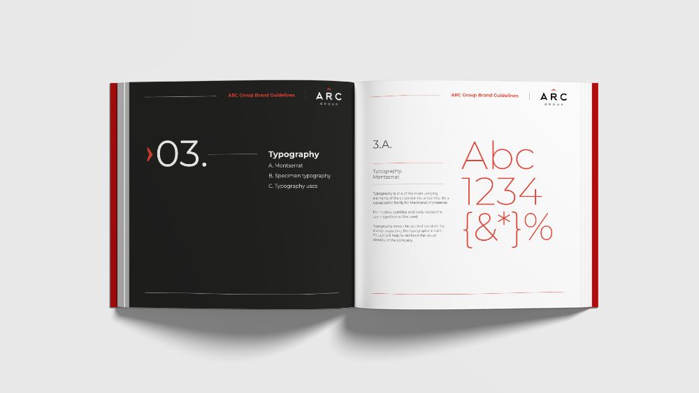
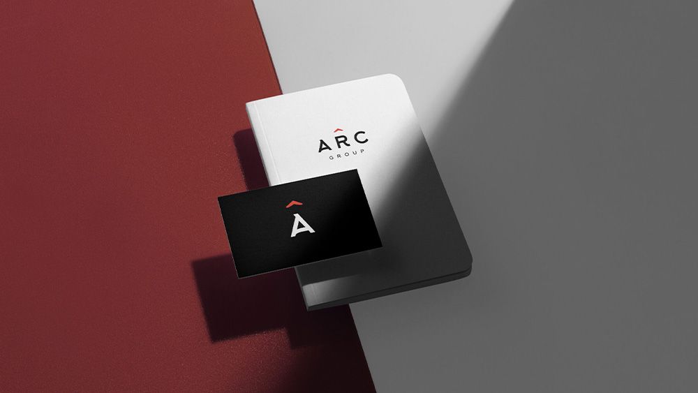
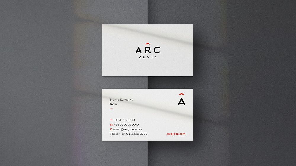
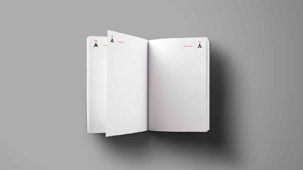
Once the logo had been composed, a whole graphic ecosystem was designed around it, a visual universe made up of display and edition typographies, icon and infographic systems, illustrations and photographs, and all the graphic elements necessary to build a complete and coherent visual identity. To close the process, this entire visual world was poured into the brand's corporate pieces, in all the points of contact between the firm and its public, such as stationery, digital spaces, physical spaces, merchandising, etc.

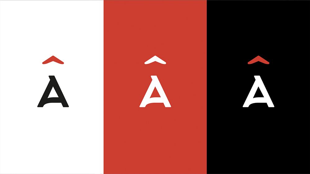
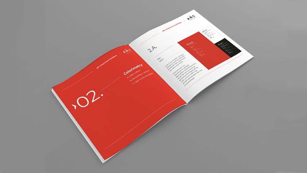
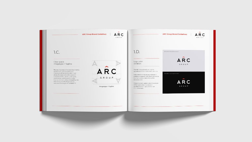
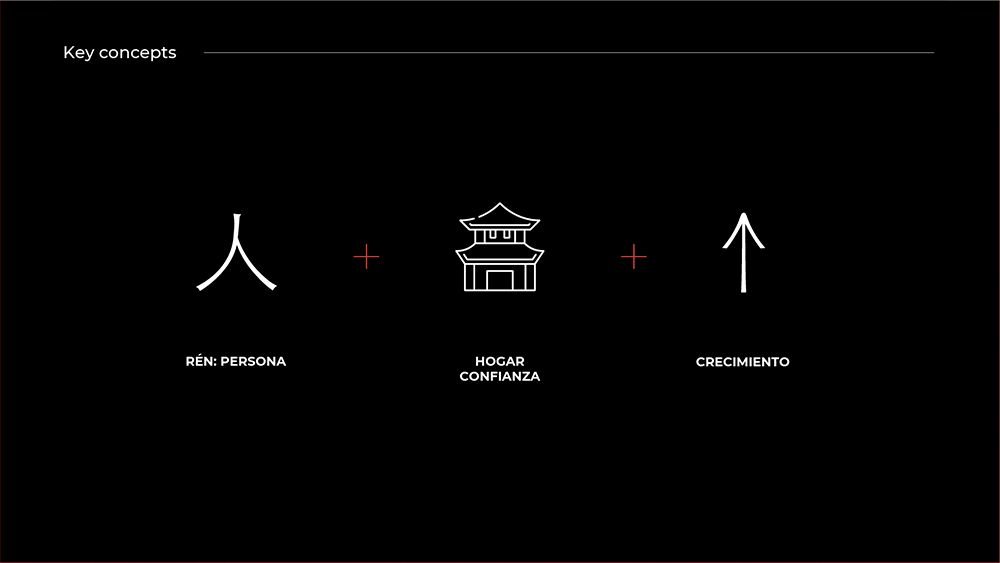
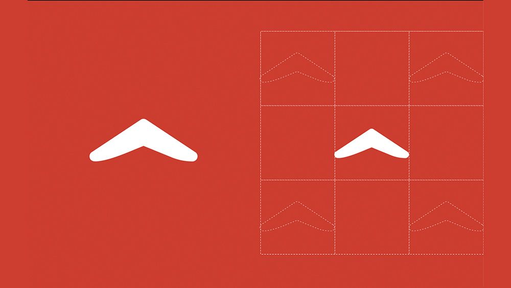
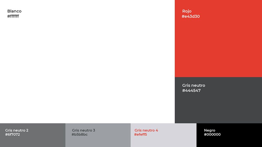
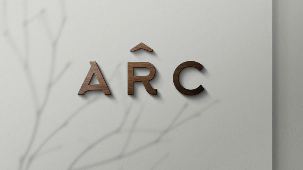
Under these parameters, we proposed a brand that would visually transmit, on the one hand, trust and personal closeness, and on the other hand, a clear harmony with Asian aesthetic codes. We added a symbol, an isotype, to the logotext. The Chinese alphabet letter REN, which means person. With the morphology of this sinogram we represented three key values for both the brand and the country; the importance of personal relationships for business, the confidence generated by feeling at home, at home, and the ascending arrow as a symbol of personal and economic growth. As a chromatic proposal, a palette was chosen with red, the colour of good luck in China, as the main colour, supported by black and a scale of greys.

Marca ARC en diferentes colores
Search