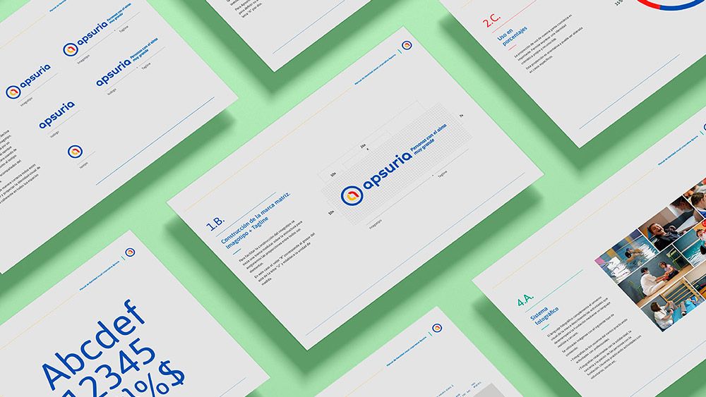
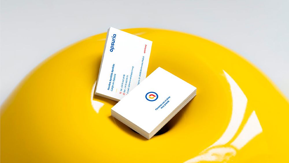
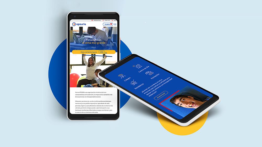
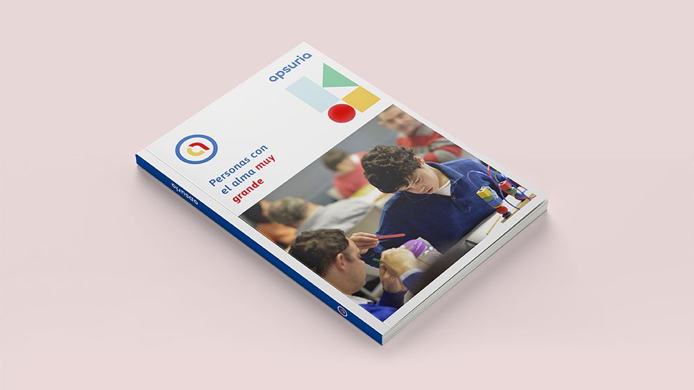
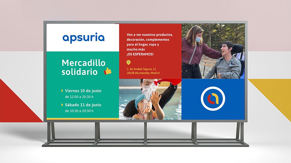
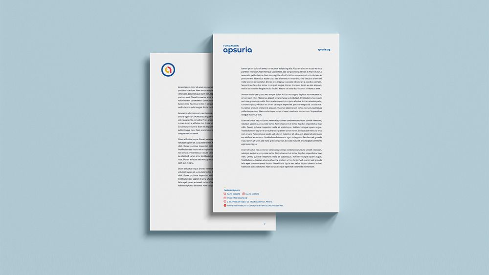
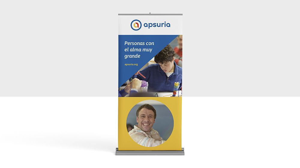
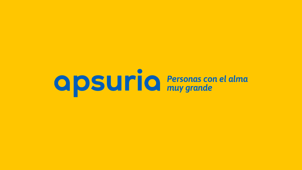
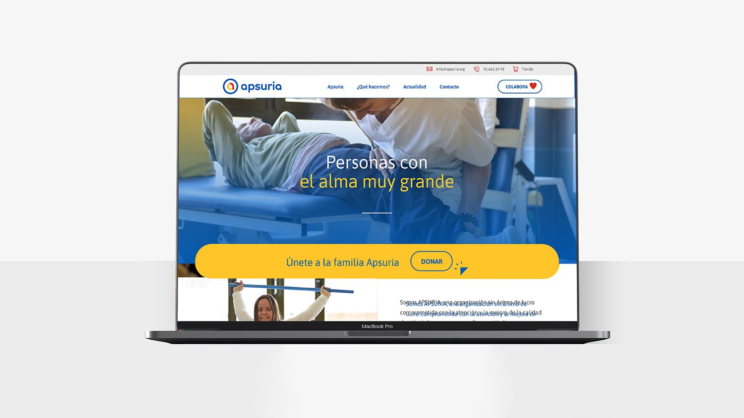
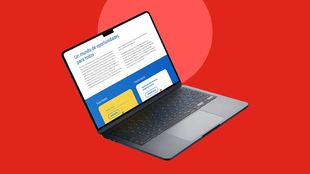
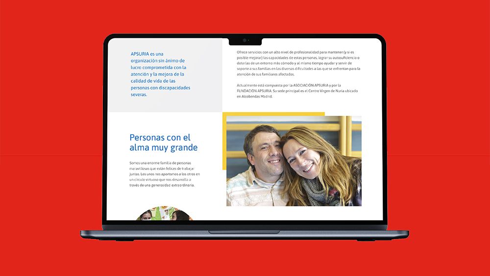
APSURIA is a non-profit organisation dedicated to the care and improvement of the quality of life of people with severe disabilities. Quum was in charge of the redesign of its visual identity, from the restyling of its logo in its two derivatives, Apsuria Association and Apsuria Foundation, and its graphic universe, to its application to all its corporate and communication tools.

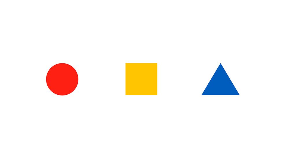
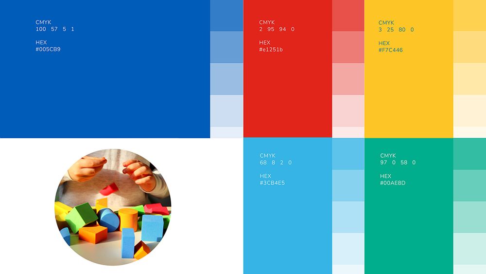
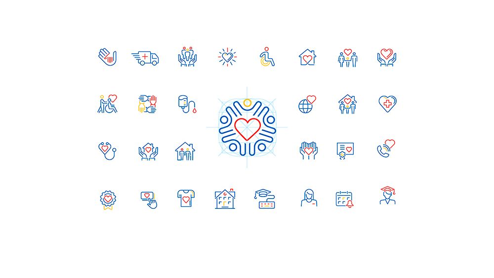
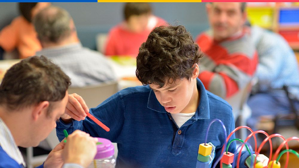
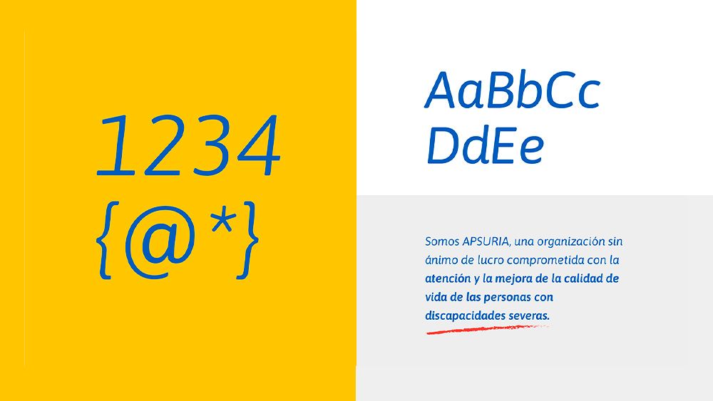
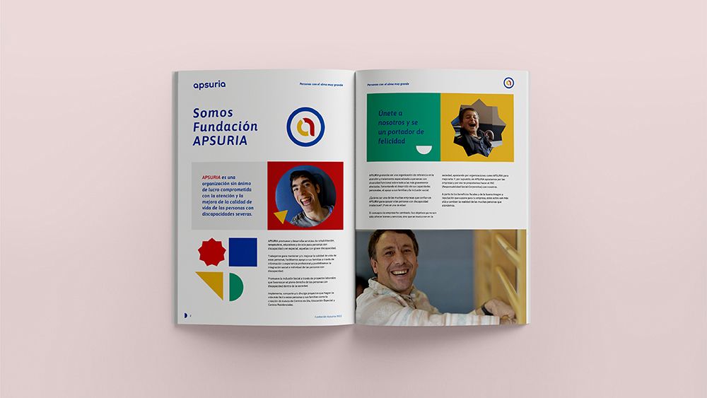
The new logo was complemented by a graphic imagery composed of basic geometric shapes; circles, squares and triangles, and a primary colour palette; blue, red, yellow and green, visual system that symbolises the didactic games used by the users of the organisation to do their learning routines.This new visual world, with the addition of new typography, illustrations, icons, infographics and photographs, was applied to all its physical and digital graphic supports.

"The visual system symbolises the didactic games used by the organisation's users in their learning routines".

The revision of the organisation's logo was a balancing act between respect for its original symbolism created by the organisation's founder, a symbol in the form of a disjunct hoop with two partitions representing the disconnection, the brain break that occurs in people with disabilities. And the renovation of its shapes and colours to achieve a graphic representation of the brand that was more up-to-date, flexible and scalable, capable of functioning in mainly digital environments.
By clicking "Accept" you agree to cookies being stored on your device in order to improve site navigation, analyse internal site usage and assist our marketing research.