


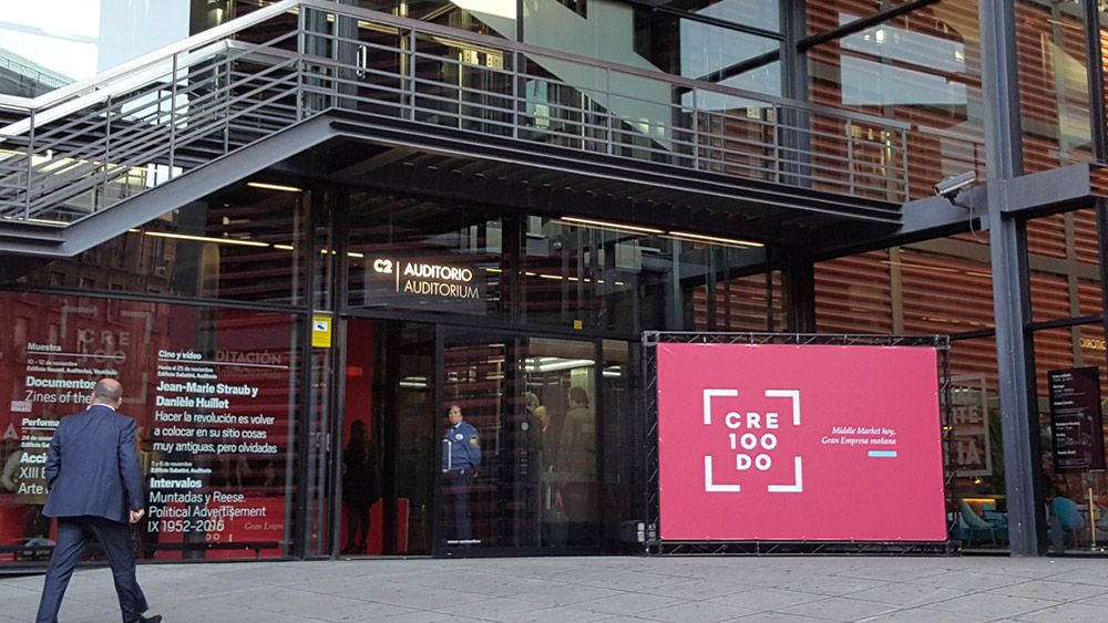
portada fondo rosa logo cre100do

cre100do

Helping to grow

Cre100do is a business transformation programme created by the Bankinter Foundation for Innovation, ICEX and the Círculo de Empresarios, which over the next five years will accompany 100 Spanish companies to become great by paving the way for others. Cre100do's vocation is to develop a reference framework for the growth of companies that will benefit the country, disseminating high-impact business concepts and practices.

The collaboration between Cre100do and Quum began with workshops for the repositioning of the brand, once the activity had begun, the brand needed to consolidate its corporate values and define a more established positioning. Once defined, work began on the best way to transmit its benefits and virtues visually to its audiences. This new positioning pointed to the need to rethink a graphic identity that was more disruptive than conservative, a brand that would point to the programme's DNA. 

A DNA based on the ideas of community, guarantee of excellence, growth and heart, a heart that pumps training and knowledge to all its participating companies.
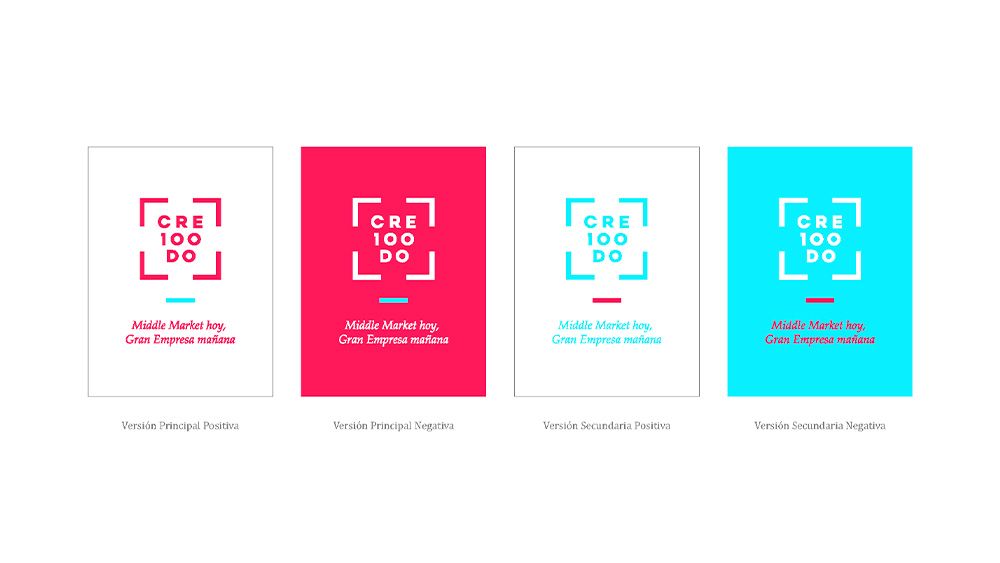

The corporate colours were revitalised by using a pure magenta and adding a cyan as a secondary colour also to the 100%, and the brand was given a graphic universe in line with these parameters. These ideas were translated into a clean, easy-to-assimilate visual concept based on a condensed pyramid sans serif typeface and an open frame that encloses it, the typography gives the brand a didactic character and the frame is a reflection of the well-known screen enlargement icon, highlighting the main idea to be transmitted, we make you bigger.

"A DNA based on the ideas of community, guarantee of excellence, growth and heart; which pumps training and knowledge to all its participating companies".

Search